I have a confession to make. I’ve been managing engineering teams for nearly two decades. I’ve always measured things — time to market, product adoption, MTTR, code quality through SonarQube. But I recently realized most of what I measured was the output. I had very little visibility into the pipeline itself — the mechanics of how code moves from a developer’s branch to production.
Sprint velocity. Standup vibes. Sonar reviews. The occasional deep-dive when something broke. A quarterly retrospective where everyone agreed we should “improve code review turnaround” and then nothing structurally changed. I had opinions about how my teams were performing. I had intuitions about where the bottlenecks were. I had exactly zero data to back any of it up.
Then we plugged LinearB into our Git repos and Jira boards. It took about thirty minutes. And the data told a different story than the one in my head.
Not worse, necessarily. Just different — and in ways that changed how I think about engineering leadership. I’m sharing what I found, including the numbers that are embarrassing, because I think most CTOs and engineering leaders are operating with the same blind spots I had. And because you can’t fix what you can’t see.
The Four Numbers That Matter
If you haven’t encountered DORA metrics, here’s the short version. The DevOps Research and Assessment program — now part of Google Cloud — spent years studying what separates high-performing engineering organizations from everyone else. They distilled it down to four metrics:
Cycle Time — how long it takes a code change to go from first commit to production. This is your end-to-end speed.
Deploy Frequency — how often you ship to production. This is your pulse.
Mean Time to Restore (MTTR) — when something breaks in production, how long does it take to fix it. This is your resilience.
Change Failure Rate (CFR) — what percentage of deployments cause a failure in production. This is your quality signal.
Four numbers. That’s it. And most engineering organizations — including mine, until recently — couldn’t tell you any of them with confidence.
Here are ours, as of this yesterday for past 7 days for all my teams (6 teams consist of mobile, web, AI, Data & ML, Spring Boot stuff and so on):

Read those numbers and you’ll see something immediately: no team is uniformly excellent. Our CFR is near zero — we almost never break production. That’s genuinely good, and the team should be proud of it. Our deploy frequency at 15.25 per day is solid — we’re shipping regularly, not batching up massive releases.
But cycle time at 7 days and 3 hours is flagged red. It takes us a full week to get a code change from first commit to production. And MTTR at 17 days and 5 hours is, frankly, painful to share publicly. When something does go wrong, we’re slow to recover.
The point isn’t to celebrate or flagellate. It’s that this shape — strong on quality, solid on frequency, slow on speed, poor on recovery — tells you something specific about your engineering culture and process that no amount of standup conversations will reveal. And it tells you where to focus.
Where the Time Actually Goes
The aggregate cycle time number — 7 days, 3 hours — is useful, but the real insight is in the breakdown. LinearB decomposes cycle time into four phases: Coding, Pickup, Review, and Deploy.
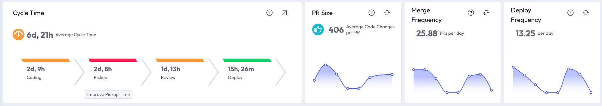
Look at those numbers carefully. Coding takes 2 days and 9 hours. That’s a developer writing and pushing code. Fine — that’s the work itself.
But Pickup — the dead time between a PR being opened and someone starting to review it — takes 2 days and 8 hours. Nearly as long as the coding. This is the silent killer. Nobody mentions pickup time in standups. No engineer files a ticket saying “my PR sat untouched for two and a half days.” It’s invisible without instrumentation. And it’s where almost a third of our total cycle time goes.
Review itself takes another day and a half. Deploy is the fastest phase at 15 hours — our CI/CD pipeline is reasonably healthy.
The actionable insight is obvious once you see it: we don’t have a coding speed problem. We have a pickup problem. Engineers are finishing work and then waiting — sometimes for more than two days — for another human to start looking at it. Fixing that doesn’t require better engineers or faster coding. It requires a process change: review SLAs, better notification routing, or — as I’ll get to shortly — AI-assisted review.
Now here’s what made it even more interesting. We have multiple teams, and their profiles are dramatically different:


Same organization. Same tools. Same leadership. One team runs at 2 days 6 hours total cycle time with clean PRs averaging 314 code changes. The other runs at nearly 4 days with bloated PRs averaging 826 changes. The fast team’s pickup time is under 8 hours. The slower team’s is nearly 23 hours.
The PR size difference is worth pausing on. A PR with 826 code changes is hard to review. It takes longer to understand, longer to critique, longer to approve. Reviewers see a large PR in their queue and unconsciously deprioritize it — they’ll pick up the small one first. Large PRs create their own pickup delay. It’s a feedback loop: big PRs → slow pickup → long cycle time → frustrated developers who batch even more work into the next PR.
Before LinearB, I would have said both teams were “doing fine.” The data says otherwise. And the data points to a specific, structural intervention: help the slower team break their PRs into smaller units. That single change would likely cascade into faster pickup, faster review, and shorter cycle time. No new tools required. No hiring. Just visibility leading to a different behavior.

The Planning Accuracy Wake-Up Call
This one was humbling.

Planning accuracy: 25%. Capacity accuracy: 30%. Meaning: our teams are completing roughly a quarter of what they planned for each iteration, and our sense of how much work we can absorb is off by 70%.
There are 100 items of added work against 797 planned. The 3-month average tells the story more clearly: 22 completed story points per iteration, with 9 points of unplanned work added.
I’m not going to pretend I know exactly what’s driving this. It could be over-commitment — planning for the best case instead of the realistic case. It could be interrupt-driven culture — support escalations, urgent requests, context switching. It could be poor estimation — story points that don’t reflect actual complexity. It’s probably all three.
But here’s what I know for certain: before this dashboard existed, we would have had the same planning conversations, the same sprint retrospectives, the same vague agreement that “we need to plan better.” Now we have a number. 25%. And that number is a baseline we can move. Not with a motivational speech. With structural changes: smaller sprint commitments, explicit interrupt budgets, estimation calibration sessions using historical data.
The investment profile breakdown is also telling: 50% stories, 28% tasks, 21% bugs, 1% change requests. That 21% bug ratio is worth watching. It means roughly one in five things our team works on is fixing something that shouldn’t have been broken. Cross-reference that with our near-zero CFR and you get a nuanced picture: we’re not breaking production, but we’re spending significant effort on quality issues that surface before deployment.
The AI Review Experiment
Around April 19th, we turned on AI-powered code review.

Coverage went from 0% to approximately 100% overnight. The number of AI-reviewed PRs spiked from zero to over 50 per day.
I want to be honest about where we are with this: it’s been days, not months. It’s far too early to draw conclusions about quality impact, defect rates, or whether AI review catches things humans miss (or misses things humans catch). I don’t have the data to make those claims, and I’m skeptical of anyone who does after a week.
But here’s what I’m watching for, and why I’m cautiously optimistic.
Remember the pickup problem? Two days and nine hours of dead time between a PR being opened and a human starting to review it. AI review doesn’t replace human review — at least not yet, and maybe not ever for meaningful architectural decisions. But it does provide near-instant first-pass feedback on every PR, the moment it’s opened. That means the developer gets something back immediately: style issues, obvious bugs, test coverage gaps, documentation reminders.
If that first-pass feedback is good enough, two things happen. First, the developer can iterate before the human reviewer even looks at it — cleaning up the easy issues so the human review focuses on the hard stuff. Second, the psychological barrier of the empty queue disappears. A PR that already has one round of feedback feels less daunting to pick up than one that’s sitting cold.
Will this move our pickup time from 2 days 9 hours to something meaningfully lower? I think so. But I’ll share the data when I have it, not before.
The Trap: Don’t Optimize a Metric. Read the System.
I’ve spent the last few sections zooming into individual metrics — cycle time, pickup time, planning accuracy. That’s useful for exposition. It’s dangerous as a management practice.
There’s a concept in economics called Goodhart’s Law: when a measure becomes a target, it ceases to be a good measure. The British economist Charles Goodhart originally applied it to monetary policy, but it describes what happens in engineering organizations with uncanny precision.
Tell a team their cycle time is too high, and they’ll find ways to shrink it. They’ll ship smaller PRs — good. They’ll also skip thorough review, cut testing corners, and push code that technically deploys faster but breaks more often. You’ve improved one number and degraded another. Your cycle time chart looks great. Your CFR chart, two months later, does not.
This is why you never look at one metric in isolation, and why you never focus on one team’s snapshot.
The DORA metrics are designed as a system. They check each other. Cycle time and deploy frequency measure speed. CFR and MTTR measure stability. Improving speed at the cost of stability isn’t progress — it’s debt with a delayed interest payment. The question is never “how do we reduce cycle time?” The question is “how do we reduce cycle time without increasing change failure rate or degrading MTTR?”
The same principle applies across teams and across time. Our team with the 2-day cycle time and 286-line PRs looks great right now. But I need to watch that over weeks and months. Is that velocity sustainable, or are they burning out? Is the low PR size a sign of disciplined decomposition, or are they splitting work into fragments that create integration headaches downstream? A single week’s dashboard is a snapshot. The trend is the truth.
In practice, this means I look at the dashboard the way a doctor reads a panel of blood tests — not by fixating on one number, but by reading the relationships between them. High deploy frequency with near-zero CFR? Healthy. High deploy frequency with rising MTTR? Something is being papered over. Improving cycle time with stable CFR? Real progress. Improving cycle time with declining planning accuracy? The team is moving faster on the wrong things.
The point of instrumentation isn’t to give you a number to optimize. It’s to give you a language for conversations that were previously impossible to have with precision.
What I’d Tell a CTO Starting from Zero
If you’re running engineering teams and you don’t have instrumentation on your pipeline, here’s what I’d suggest — not as someone who’s figured it all out, but as someone who wishes he’d started sooner.
Start with DORA. Connect your Git provider to LinearB (or a similar tool — there are others). It takes less than an hour. You’ll have your first dashboard the same day. The first time you see your real cycle time broken into Coding, Pickup, Review, and Deploy, you’ll have at least one “I didn’t know that” moment. Probably several.
Look at the breakdown before the aggregate. A 7-day cycle time could mean “everything is slow.” Or it could mean “coding is fast, pickup is broken, review is fine, deploy is healthy.” Those are completely different problems with completely different solutions. The aggregate hides the diagnosis.
Watch trends and interactions, not snapshots and single numbers. This is the Goodhart’s Law antidote. Never set a target on one metric without watching what happens to the others. Review the dashboard weekly, but make decisions monthly. One bad week is noise. Three bad weeks in a row is signal.
Compare your teams to each other, not to industry benchmarks. The DORA report will tell you that “elite” teams deploy multiple times a day with less than one hour of cycle time. That’s interesting but not actionable for most organizations. What is actionable is that your Team A has an 8-hour pickup time and your Team B has a 23-hour pickup time. Same organization, different outcomes. The variance within your own company is more useful than someone else’s average.
Share the data with your engineers. This is the most important one. The teams that see their own metrics improve faster than the teams whose managers hoard the dashboard. Engineers are problem-solvers by nature. Show them the pickup time breakdown and they’ll start self-organizing around review SLAs. Show them the PR size data and the faster team becomes the model. Transparency does more than any process mandate.
And be patient with yourself. Our planning accuracy is 25%. Our MTTR is 17 days. These are not numbers I’m proud of. But they’re numbers I know, and that’s the prerequisite for every improvement that comes next.
------
I’ve shared what I’m seeing. If you’re using LinearB or something similar — or if you’ve found a different way to instrument your engineering pipeline — I’d love to hear what metric surprised you most. And what you did about it.